

For someone who is not a “beach” person, I do spend a lot of time in Florida. (Grandchildren have a lot to do with determining one's travel destinations.) I do like the beach colors and the casual style. When
I saw this at an RV park in Florida, I couldn't wait to give it a try. I had no idea where I could use it.

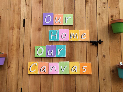
Hiding an ugly area while creating a way to access the roof, Hand Randy created the perfect spot, right outside my studio
door.

From the ends of the pickets used to face the plant deck, he
cut the bases for the letters. Using white paint, I gave each base a coat.

Then the fun started! From my stash of multi-surface craft
paint, I chose beachy colors to brush over the white. With my Silhouette Portrait, I cut the
stencils for the letters. For stencils to use on wood, I use ugly contact paper
that I can find really cheap at yard sales. (Okay, maybe this one isn’t so
ugly, but it was cheap, 50 cents for the roll.)

I found the heavy acrylic paint
and a stencil brush (instead of a sponge dauber) worked really well on the
rough wood. I hand painted the shadows to give the letters more definition.
So, here you have it, our creative statement. It truly
states how we feel about our 80 year old cottage.
No comments:
Post a Comment