Our house is pretty old, I think about 80 years. Eleven
years ago we bought it from a fixer-up kind
of guy who had purchased it in a foreclosure sale to flip. He did the
minimum so it would look good enough to sell; cheap paint, cheap cabinet doors,
etc. Fortunately he did install good double-pane windows downstairs. It is a
very sturdy double brick house in a great neighborhood and we love it. Over the
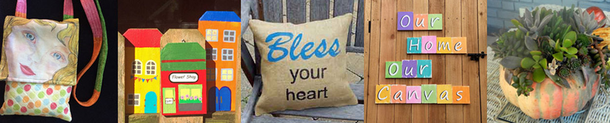
years it has been our canvas as we have added a bath, a garage, a carport, a
screened porch, a garden and a studio. We have painted the entire downstairs
and replaced the windows upstairs. I so want Handy Randy to make new farmhouse style cabinet doors, but first we
must finish the upstairs and rebuild a fence that was damaged in an ice storm a
few years ago.
All of this to say, the paint on the doors beneath the
kitchen sink was peeling and looked pretty tacky. I saw an opportunity to be
creative! Off the doors came and down to the studio where I copied Alisa Burke’s style.

After painting the doors with chalk paint, I used a Sharpie
to draw on the panels. I sealed them with two coats of wax. The knobs were
painted with enamel paint (because
I had some in my stash) and multi-purpose paint.
Using the Silhouette Portrait, I cut the words from Oracal 651 Matte Black Vinyl. I learned that all vinyl is not the same. My first attempt I tried an inexpensive vinyl; it tore easily and did not adhere to the wood (So frustrating!) Then I did some research (I know, I would have saved time if I did this first) and learned Oralcal 651 is highly recommended. I can understand why! It cut smoothly, didn't tear and adhered beautifully.
I like it even if it doesn’t look as polished as Alisa’s
work. If you are not familiar with her, you should hop on over to her blog and
see what I am talking about!